Yummy!
Corporate identity, branding, artistic direction
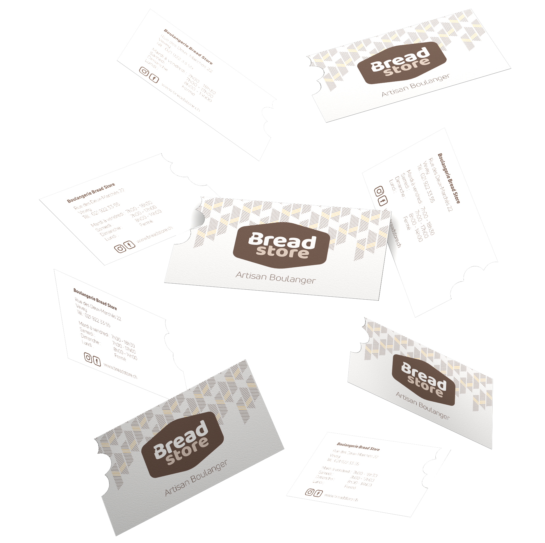
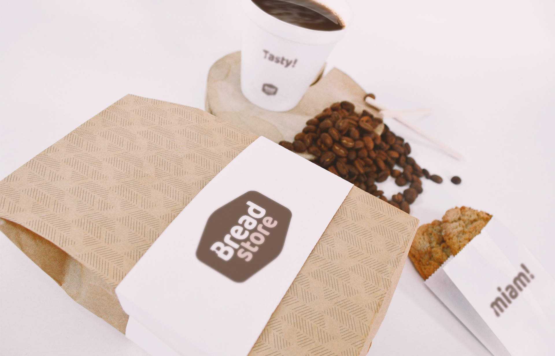
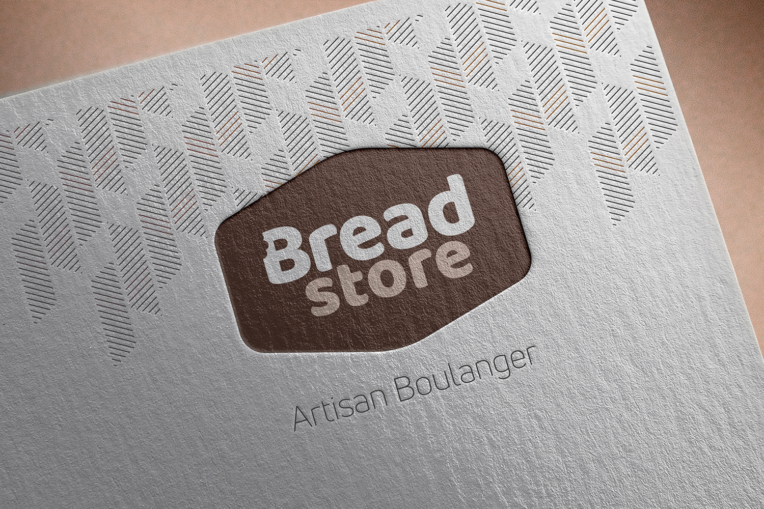
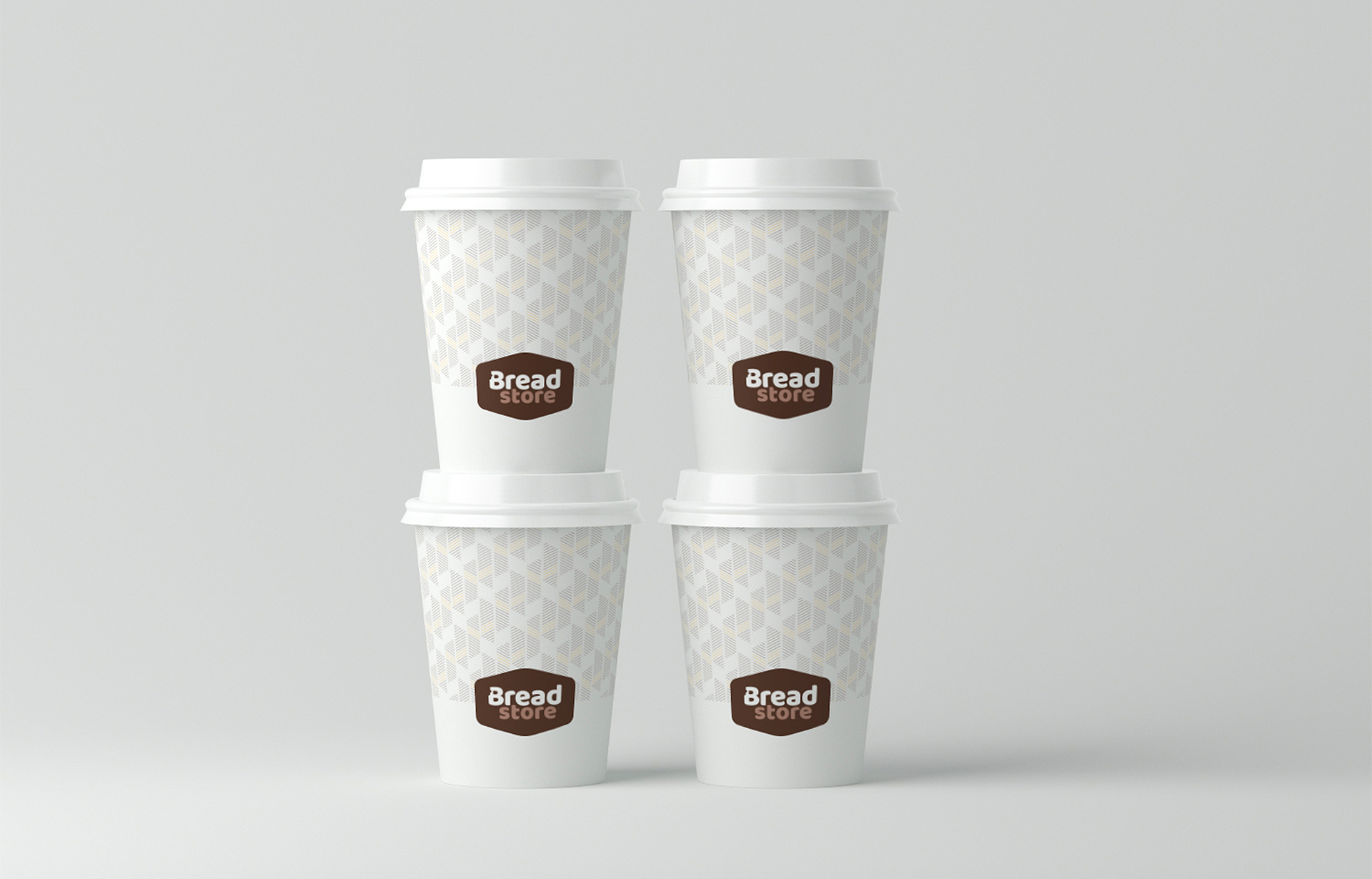
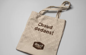
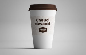
Bread Store, baker, result of a meeting between two gastronomy lovers sharing the same requirement and transcendence values.
Creation the full identity of the new brand Bread Store, transcribing the values of effort and unique know-how of the company.


Typographic choice
Modern and round, the chosen font evokes gluttony and warmth. The typography corresponds to the product, the bought bread.
Tones and structure
The bite imprint corresponds to the taste, the pleasure of eating a good product and the irresistible desire to taste it without waiting. The form evokes the store, the place “where it all happens, where it is made”. The tones evoke breadcrumbs, the softness. This is usually the children’s favorite.